

How To Look Unfairly Competent the Next Time You Present
One prompt turns your raw data into a fully animated deck (in about twenty minutes, not five hours)

Remember that week you spent cooking data, and then served it to your team like it was a gas station hot dog?
And then the slacker who presented right after you, with half the analysis and twice the polish, walked off with all the credit.
This scene plays out in meeting rooms every day. Anytime you present, you’re doing two jobs at once:
Make sure the numbers are absolutely rock-friggin-solid
Present them in a way that LOOKS AMAZING
Most people - especially engineers - only ever nail the first one. The second is slow, fiddly, and can eat four or five hours of your night, so it’s the part everyone shortchanges.
That’s why I built a super-prompt that handles it for you.
Point it at the data you worked so hard on, and it builds a beautiful, fully animated deck that blows your boss’s hair back.
Here’s everything this prompt does for you:
It interviews you about your brand, the story you want to tell, and the metrics you most want people to notice
It drafts the titles, subtitles, story, and what belongs on each slide, then gets your sign-off before it builds
It builds a beautiful animated slide deck, one chart per slide, with clear labels, clean trend lines, and contrasting colors that pull the eye to the metric that matters most
It makes you look like an absolute stud in front of your boss and your colleagues, and the envy of everyone in the room
Point the prompt at your data, and you’ll get back something you’d be proud to present anywhere.
This is for anyone who regularly presents data. Project managers, marketing agencies, freelancers, consultants reporting back to a client. Engineers especially, because you all love data but hate making it look pretty.
Instead of losing half a day trying to wrestle your data into something beautiful, you can run this prompt and it is done in about twenty minutes.
Sound good? Let’s go 👇
If this looks worth your time, save it, give it 20 minutes this week, and send it to the one friend you know that needs it.
The meetings where 1 wrong number follows you for years
We all know what it feels like to get called into your boss’s office to walk through the numbers. Or worse yet, maybe it’s not just your boss, maybe it’s a whole room full of VPs. Or the real nightmare, a client deciding whether to keep paying you.
There’s a lump in your throat. You know the stakes are high. The data has to be right, and it has to look good. If even one number is off, or one data label is too small to read, your reputation takes a hit.
I’ve been in this spot a million times.
The scariest presentations I ever gave, hands down, were back in network ops at a Fortune 50 telecom company I used to work for. I had to present project readiness in front of all our VPs. One of them had 6,500 people in his department. My job was getting all of those people, his entire department of 6,500 people, ready for a +$100,000,000 technology we were rolling out.
(NO PRESSURE! 🤮)

Even today, I can’t really believe that I did most of my presenting straight from a spreadsheet.
The spreadsheet had a table with hundreds and hundreds of rows and tracked every team, and every readiness task. It took 10+ meetings every week just to keep it updated. The charts were powered by a bunch of crazy formulas I wired together.
Just wrangling the data alone was BEYOND PAINFUL.
In the end, the spreadsheet looked okay, presentable enough for my VPs in our department. But it was never something I would have shown anybody outside our organization.
I’m sure you’ve been in similar situations.
There are 2 ways to look like an idiot up there
Let’s be honest about what’s on the line:
Anytime you present in front of other people, your reputation, your status, and how people see you is at stake.
Present data that’s wrong, get called out in front of everybody, and the embarrassment is freaking awful. You’ll look like, or at least feel like, a complete and total idiot.
Present data that’s right but the charts are a mess, the labels too small, the colors weird, anything that shows you can’t handle data, and you still look like an idiot, just a different kind of idiot.
I know somebody reading this is going to roll their and think, “Yeah, well... substance matters more than form.”
Sure, I agree.
If you stack rank the priorities, what the data says is more important than what the data looks like. But anybody who tells you the way it looks doesn’t matter at all is just wrong.
The colors, the fonts, the size of the labels, it all creates an impression. It sets a tone, it gives you authority, and it moves people toward your point of view. Or it quietly reinforces that you’re not the type of person to put in front of clients, executives (or anyone else that matters).
THIS is why aesthetics are important. They increase trust. They communicate that you understand corporate etiquette. That you can be trusted in front of the people that matter.
4 hours of work done in 20 minutes
Here’s the good news:
You don’t have to do any of this by hand anymore.
I’ve made a prompt that does the whole thing. You copy it, paste it, and point it at the data you already have. That’s it.
The work that used to eat four or five hours of your night, building charts, fighting formulas, fussing with labels, AI handles in 20 or 30 minutes.
And it doesn’t just spit out a file and hope. First it looks at your dataset. Then it runs a short interview. It asks about your brand colors, the story you’re trying to tell, and the metrics you actually want people looking at. It takes your answers and writes up a quick brief.
Then it builds the thing.
What comes out is beautiful, clean, and easy to read. It frames the numbers inside an actual narrative instead of letting them just sit there. It’s the kind of presentation you’d feel completely comfortable putting in front of your boss, your VPs, a board, or a client.
You gotta understand:
When people stop and pay attention to YOU, your status goes up. AND THIS will help you make the right impression.
THIS will help you blow their friggin’ socks off.

You’ll stop being known the person who threw a messy spreadsheet on the projector and become the one who clearly knows how to handle data, the expert in the room.
All from one simple prompt you copied and pasted.
Let me just show you how good this looks
Let me show you how awesome this is.
I use this prompt regularly, but since I can’t share private company info in public, I’ve used synthetic data for the example below.
I ran this on a data set from a fictitious company called Munder Difflin.
After a short interview, the prompt built the charts, added clean data labels, drew trend lines, and animated them. It also used contrasting colors to pull your eye straight to the numbers that matter most. It gave every chart its own page so your audience won’t get overwhelmed.
I used to grind every one of these little details out by hand. But this prompt did all of them at once, and it did them well.
Take a look:
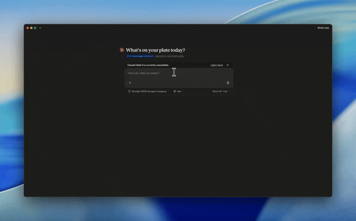
Here’s the whole prompt, just copy and paste it
It’s one prompt.
You paste it into an AI that can open your files and write code (I run this in Claude Cowork, but anything with file access will do), then you point it at your spreadsheet. Your messy, multi-tab, hundreds-of-rows sheet, exactly as it sits right now.
No need to clean it up first. The prompt handles that part.
Grab all of it, paste it into a fresh chat, and point it at your sheet 👇
Keep reading with a 7-day free trial
Subscribe to AI Chops to keep reading this post and get 7 days of free access to the full post archives.