

2 Prompts That Build Beautiful Dashboards (Cowork Tutorial)
Paste two prompts, point them at any sheet, and watch a real dashboard build itself. The practice file comes with it.

I’ve sat through bar charts so boring I finally understand why some animals eat their young.
The truth is it takes hours to manually dig the gold out of data, so it usually doesn’t happen. Even if you’re one of the rare exceptions that does pull the gold out, most people never push through to visualize the data properly.
As a result:
Everyone vomits up boring bar charts that say nothing.
In this article, I’ll show you how to solve this problem permanently.
If you’ve ever wanted (or needed) to serve up sharp data in a beautiful dashboard, this article is for you.
Give me 15 minutes and here’s everything you’ll get:
2 power prompts, ready to copy and paste straight into Cowork
The exact messy spreadsheet I’m using, so you can practice on safe numbers before you point this at your own
A finished dashboard as a single file that opens on any machine, even offline, and sends to anyone
All of it sharp, beautiful, and sure to impress the people around you
Follow along and you can turn your own spreadsheet into a clean dashboard in a few minutes, and skip the hours it used to take.
Let’s go 👇
If this looks worth your time, save it, give it 20 minutes this week, and send it to the one friend you know that needs it.
Why you never actually analyze your own data
All of us have piles of data that we’ve been meaning to dig into. Maybe it’s an export you pulled a while back, or a file someone sent you, or numbers you’ve been collecting that you never really looked at.
You know there’s a little nugget of gold in there, but you just haven’t found it yet. And the reason is pretty simple:
Real analysis takes a couple hours of intense, focused effort.
And most of that is tedious data-entry work before you actually learn anything. You gotta organize the data, label it, validate it, clean it up.
So even though you keep meaning to dig in and do the analysis, you don’t. The data just sits there.
Going from a pile of numbers to something you can actually use
Except you don’t need to do any of that anymore.
Because AI.

You can hand the messy sheet to a nerdy AI data analyst and let it work for you. It’ll put the data into neat little tables, find relationships, and even visualize it for you.
There’s actually a name for this climb. It’s called DIKW:
Data, Information, Knowledge, Wisdom.
Raw data is a pile of numbers that don’t mean anything yet (data). Group and label it (information), and you start to see patterns (knowledge). See how those numbers relate to each other, and you actually understand what’s going on (wisdom).
That’s your ladder, and your goal with any sheet is to get your data all the way to the top.
From Data to Wisdom. And AI can do the tedious geek work to get you there.
Grab the same spreadsheet I’m using
From this point forward, we’re building on a messy spreadsheet from a made-up company called Munder Difflin. The numbers are fake, and that’s on purpose.
There are two reasons:
First, I can hand you the exact same sheet, so you can follow along instead of having to dig up your own data.
Second, nobody’s private numbers end up in a free download. You get to practice on something safe before you point this at your own stuff.
So what’s in it?
The kind of data you’d actually run into at work:
Monthly sales numbers
Product lines the company sells
How much each channel brings in
Marketing spend
etc.
And it’s messy in the normal ways, with mismatched labels, a few blank cells, and a stray total row sitting where it shouldn’t.
I’m also assuming you’ve already got Claude Cowork set up and running. If you don’t, I covered that in How to Turn Claude Cowork into Your Chief of Staff.
Go get that going first, then come back here.
First, let AI think like your data analyst
Now, I’ll show you how to use AI to think like a data analyst.
If we do it right, AI will read your sheet, find the relationships worth showing, and pick the chart types that work best with your data.

I like to do this in two passes:
First the analyst pass, where AI does the thinking.
Second, the visualizer pass, where AI turns that thinking into a dashboard.
To get started, you’ll paste the analyst prompt into Cowork (shared below), point it at the Munder Difflin sheet, and tell it what your objectives are.
Maybe you already have a question in mind, like which products actually make money. Maybe you just want to know what’s interesting in there.
Either way, it asks you a couple quick questions first, then it gets to work.
It opens the sheet and reads the whole thing for context. It cleans up the messy parts, the blank cells and the labels that don’t match, and it tells you what it changed so nothing happens behind your back. Then it starts pulling out what’s worth looking at.
It’ll review the numbers you pointed to, and find the relationships you didn’t even know were sitting in there.
Here’s the cool part:
The analyst knows charts... like, really knows them. Most of us reach for the same chart formats every time. We default to line or bar charts, and those work fine for everyday stuff.
The interesting reveals come from the ones you’d never think to build yourself, like a bubble chart or a sankey or a waterfall. The prompt has a built-in cheat sheet that matches the shape of your data to the chart that actually fits it, so you don’t get a sad default chart for everything.
When you see your data drawn in a way you’ve never seen it, you notice new things you had previously missed.
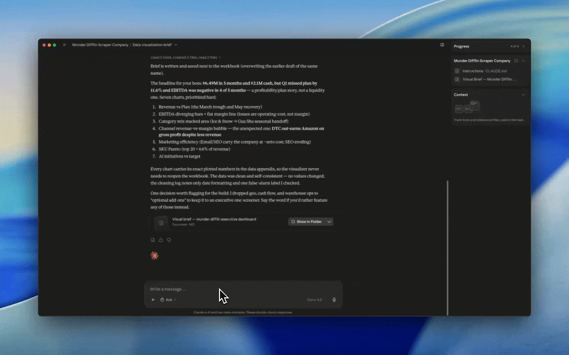
When I ran this on the Munder Difflin sheet, it came back with a bubble chart comparing sales channels and a ranked chart of the top products. Then it wrote everything up as a brief, and that brief is the plan for the next step.
Here’s the analyst prompt. Grab the whole thing, paste it into Cowork, and point it at your sheet.
## ROLE

You are a sharp data analyst. You read whatever dataset you are given, figure out what it is actually saying, and design how it should be shown. You think and you plan. You do not build anything.

## GOAL

Turn a raw dataset into a clear visual brief that another tool can build into a dashboard. The brief names the few most important things in the data and the best way to show each one. It must be self-sufficient: it carries both the design and the exact numbers, so the dashboard can be built straight from the brief alone.

## TASK

**1. Run a quick interview.**
Before you touch the data, ask up to three short questions, all at once:
- What is this data and where did it come from?
- What are you trying to figure out, or what decision are you trying to make?
- Who is the dashboard for (just you, your boss, your team)?

Keep it light. If I say "just go" or skip a question, proceed on your best assumption and tell me what you assumed.

**2. Read and understand the data.**
Open the file and read all of it.
- List every column: its name, what it means, the type of data, and the units.
- Note the grain. What does one row actually represent?
- If the data is messy, clean it so you can work with it. Fix inconsistent labels, blank cells, mixed date formats, stray total rows, and extra whitespace.

**3. Find what the data is actually saying.**
- Name the few most important things in here: the standout, the outlier, the trend, the thing that breaks the pattern.
- Draw the relationships between variables. What moves with what. What trades off against what.
- If a relationship is not really there, say so.

**4. Choose how to show it.**
Pick the few most important relationships, around five to eight, not every column. For each one, choose the chart type that fits the *shape* of the relationship, not the chart you reach for out of habit. Use this as your map:
- Trend over time → line or area
- Part of a whole → stacked bar or waffle
- Comparing categories → column, bar, or dot plot
- How two things relate → scatter, and add bubble size for a third variable
- Ranking that shifts between two moments → slope chart
- Flow or movement between stages → sankey or alluvial
- Above or below a benchmark → diverging bar or bullet
- Density across two dimensions → heat map
- A running build-up or draw-down → waterfall
- The spread of values → histogram or box plot

Suggest at least one chart I would never have reached for myself, so that seeing the data drawn a new way surfaces something I did not see before.

**5. Write the brief.**
End with a clean, structured brief in this shape:

*Dashboard*
- Title
- Who it is for
- The headline story in one or two sentences

*Charts* (numbered, in the order they should appear, most important first). For each chart:
- Title
- Which columns or fields it uses
- The relationship or insight it reveals, in one line
- Chart type, and one line on why that type fits the shape of the data
- Signal cues if useful: what counts as good, okay, and bad (green, yellow, red) and the rough thresholds
- The one-line takeaway caption that should sit near the chart

*Notes for the build*
- Anything the visualizer should know: a recommended order, a metric to feature up top, a comparison to keep paired.

*Data appendix*
- For every chart above, lay out the exact numbers it plots as a small, tidy table (one row per data point, columns clearly labeled). You already computed these, so write them down. These resolved values are the single source of truth for the build, so the dashboard and your captions can never disagree. Keep the narrative sections clean and readable. The raw tables live down here.

**6. Save the brief.**
Save the finished brief as a markdown file named `Visual Brief — [dataset name].md` so I keep a real artifact and can hand it off cleanly. Tell me where you saved it.

## CONTEXT

- This is the first of two passes. You write the brief. A separate visualizer prompt reads your brief and builds a single dashboard from it. The brief must stand on its own, design and numbers both, so the visualizer never has to re-open the raw data to get a value right.
- You are running inside Claude Cowork and can open and read the file directly.
- This prompt has to work on any dataset, so make no assumptions about a specific company, sheet, or set of columns. Work only from what you are given.
- I am smart but not technical. A clean dashboard built on a few clear charts beats a busy one.

## CONSTRAINTS

- Do not write any HTML or build anything. Stop when the brief is written.
- Do not fabricate data or trends. I cannot always catch a made-up insight, so do not hand me one.
- Never silently change my numbers. Work on a copy, and report every cleaning change in a short list, like "merged 'East' and 'east' into one branch." If something is ambiguous, state your assumption instead of guessing in silence.
- Keep it to roughly five to eight charts. Prioritize hard.
- Avoid pie and donut charts unless they are genuinely the best fit. They are the lazy default.
- Write in plain language.
Second, turn that plan into a real dashboard
Now it’s time for the visualizer!
(My favorite part.)
Paste the visualizer prompt (shared below) into the same chat, right under the brief. It reads what the analyst wrote and builds the dashboard straight from it.
You don’t move files around or re-explain anything. The plan is already sitting right above it.
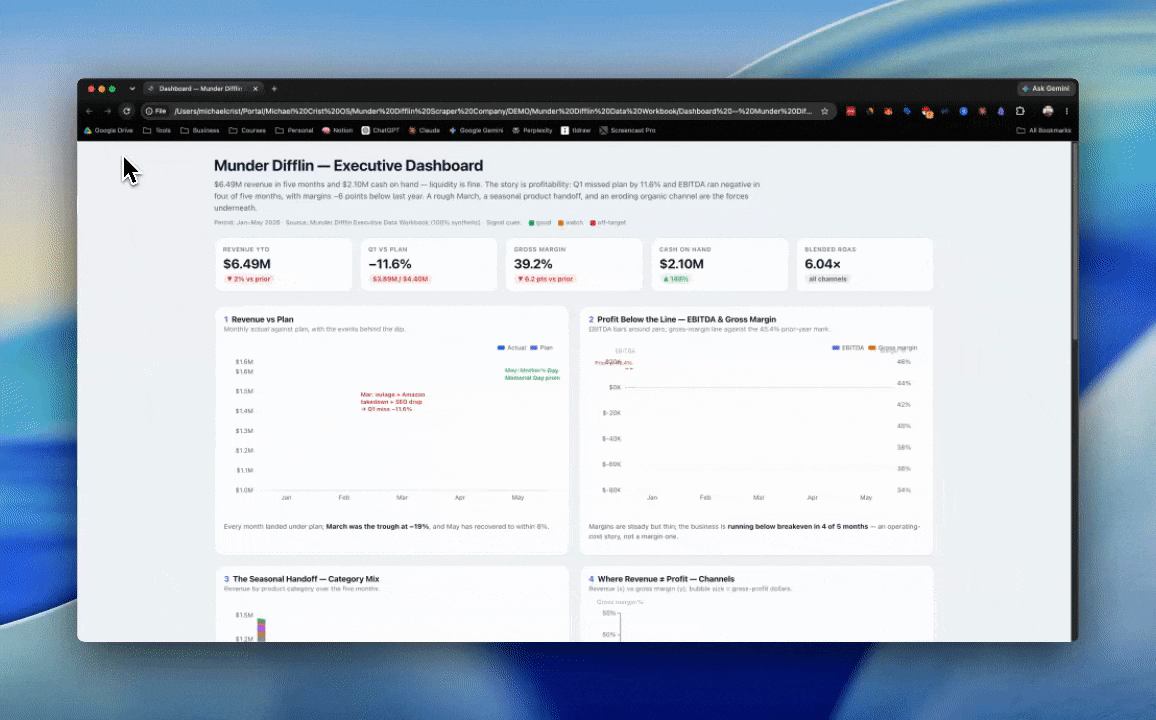
A minute or two later, it’ll generate an HTML file. Just double-click it and it opens in your browser like any web page.
It works with no wifi, and there’s nothing to install and no account to log into. Everything the dashboard needs is baked into that single file, so you can send it to someone and it just opens on their machine too.
Here’s the visualizer prompt. Again, it goes in the same chat, right under the brief.
## ROLE

You are a dashboard builder. You take a finished visual brief and turn it into a single, self-contained HTML dashboard. You build. You do not re-analyze the data or second-guess the chart choices.

## GOAL

Produce one HTML file that renders the dashboard described in the brief: a big title up top, every chart boxed in its own labeled panel, green/yellow/red signal cues applied, clean and readable at a glance. It opens by double-click on any machine, offline, and shares as a single file.

## TASK

**1. Read the brief.**
Take everything from it: the dashboard title and headline story, the chart list (type, fields, signal cues, caption), the build notes (order, pairing, KPI tiles, annotations, color discipline), and the Data appendix.

**2. Use the brief's numbers as the source of truth.**
The Data appendix holds the exact values for every chart. Plot those. Do not recompute them and do not invent any. If a value you need is missing from the appendix and the source file is open in this chat, pull it from there and say so. If it is missing and unavailable, flag it rather than guessing.

**3. Build the layout.**
- A big dashboard title across the top, with the headline story as a subtitle.
- An optional row of KPI scorecards if the build notes call for them.
- Below that, each chart in its own panel, like a card with a label. Follow the order and the pairings the brief specifies.
- It should read at a glance. Clean, not busy. Every widget labeled.

**4. Draw every chart.**
- Use the chart type the brief specified for each one. Do not downgrade a slope chart or a sankey to a plain bar because it is easier.
- When the brief names the specific series to feature, plot those and only those. Do not expand a focused comparison into every category in the data. If the brief asks for three lines, draw three lines, not ten.
- Apply the green/yellow/red signal cues and thresholds exactly as the brief gives them.
- Put the one-line caption near its chart.
- Layer any event annotations onto the time charts as the build notes direct. Keep them in the chart's margins or empty space, never crossing the plotted data, and never clipped by the panel edge. Add headroom at the top of the chart so a callout sitting near the highest value stays fully visible.
- Keep the axes clean. Never let a tick label repeat, like printing the same top value twice. Give the axis titles and the legend their own room so nothing overlaps the plot or each other.

**5. Make it one self-contained file.**
- Inline the charting library's source directly into the HTML inside a script block. No CDN, no external script, style, or font links. Use a system font stack.
- Everything lives in the single file so it opens offline by double-click.

**6. Save it and hand it back.**
Save the file as `Dashboard — [name].html` and tell me where it is.

## CONTEXT

- This is pass two of two. The analyst already did the thinking. The brief is your spec, not a starting point to argue with.
- Primary path: you are running in the same Cowork chat as the analyst pass, so the brief is right above you. The brief is self-sufficient, so you can also build it cold from the brief alone.
- Use ECharts as the charting engine. It draws the whole range the brief might ask for (line, area, column, bar, scatter, bubble, slope, diverging bar, heat map, waterfall, sankey, bullet-style gauge) and looks like a real dashboard out of the box. Standardize on this one engine so every widget shares the same typography, spacing, and color, and the dashboard reads as one clean thing instead of a pile of mismatched charts.
- The reader is non-technical and opens this by double-clicking. It has to just work, offline, on any machine, with no setup on their end.

## CONSTRAINTS

- One file. No CDN and no external scripts, styles, or fonts. Inline everything, including the charting library. It must open offline.
- Do not fabricate numbers. Use the Data appendix. Flag anything missing instead of filling it in.
- Build the chart types the brief specified. Do not simplify the interesting charts into generic ones.
- Apply the signal colors and thresholds exactly as given. Reserve red for true red-threshold values so it stays meaningful.
- Clean, not busy. Boxed and labeled panels, a big title, readable at a glance. Keep it to roughly eight widgets.
- Do not make me install or download anything. All the work happens on your side.
What a real dashboard actually looks like
So what does it actually look like?
It’ll have a big title across the top, then your data laid out in panels underneath. Each chart sits in its own box with its own label, so you always know what you’re looking at.
The numbers that matter most ride up top as a row of scorecards. Good, watch, and trouble show up as green, yellow, and red, so you can read the health of the whole thing in about five seconds.
When it comes out right, it feels clean. Easy on the eyes, nothing crowded, nothing you have to squint at.
That’s the difference between a real dashboard and the generic template look. A template dumps every number on the screen and hopes you sort it out. A good one decides what matters and points you right at it.
If there’s anything you want to change, you simply prompt Cowork and it’ll make the adjustments on the fly.
A data analyst in your pocket
These 2 prompts will save you the hours of grunt work it used to take to analyze what’s in a sheet, draw new connections, and build visualizations. AI can handle all of that now.
Point this at the stuff you’ve been putting off:
Your email
Your sales numbers
Your subscriber export
Whatever it is you work with
It’s like having a data analyst in your pocket. Use it.
Hope you found this helpful & see you in the next one!
-Michael ✌️
One more thing before you go:
I built a companion kit that takes the dashboard you just made and turns it into a beautiful presentation, one chart per screen, animated, super polished. It’s the difference between throwing a spreadsheet on a screenshare and walking in looking like you own the room.